Blynk is a well rounded IOT platform-as-a-service that offers beginners and hobby users an aesthetically pleasing and easy to use web/app dashboard builder experience with good documentation, whilst offering enough functionality behind paid tiers to satisfy some power users and businesses with simple products.
Platform
Blynk call their web interface Blynk.Console, and the mobile apps Blynk.Apps. The underlying Blynk.Cloud platform supports multi-user and multi-organisation setups.
A low-code firmware option Blynk.Edgent is available, Blynk.Air provides some level of OTA firmware updates, and Blynk.Inject is aimed at end-user provisioning of production hardware.
Common ideas/terms used across the Blynk platform are:
- DataStreams represent a channel for data to be sent between hardware and the cloud,
- Automations are the concept of cloud-driven notifications and events,
- Templates specify a set of DataStreams, and a mobile and/or web dashboard layout,
- Devices are specific singular pieces of hardware which can be added/claimed to your account
- For one-off or prototyping devices, a template is specified and an API key is provided which is included in the firmware binary
- For deployment to end-users, a device can be added to the account by scanning a QR code or manually entering a code.
The web interface is required for some configuration prior to using mobile dashboards.
Web Interface
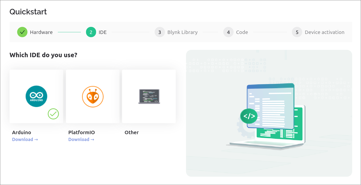
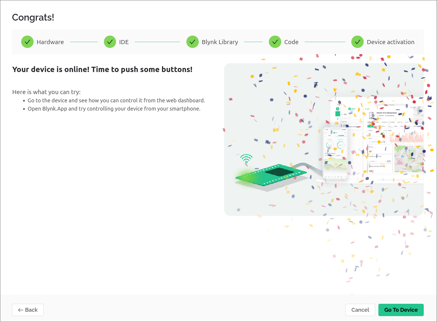
The onboarding process is well designed and user friendly, quickly guiding you through the process of getting hardware setup and connected to Blynk Cloud.
It offers turnkey paths for a good range of hardware IDE options, provides quickstart code, and finishes the wizard when hardware is successfully connected.
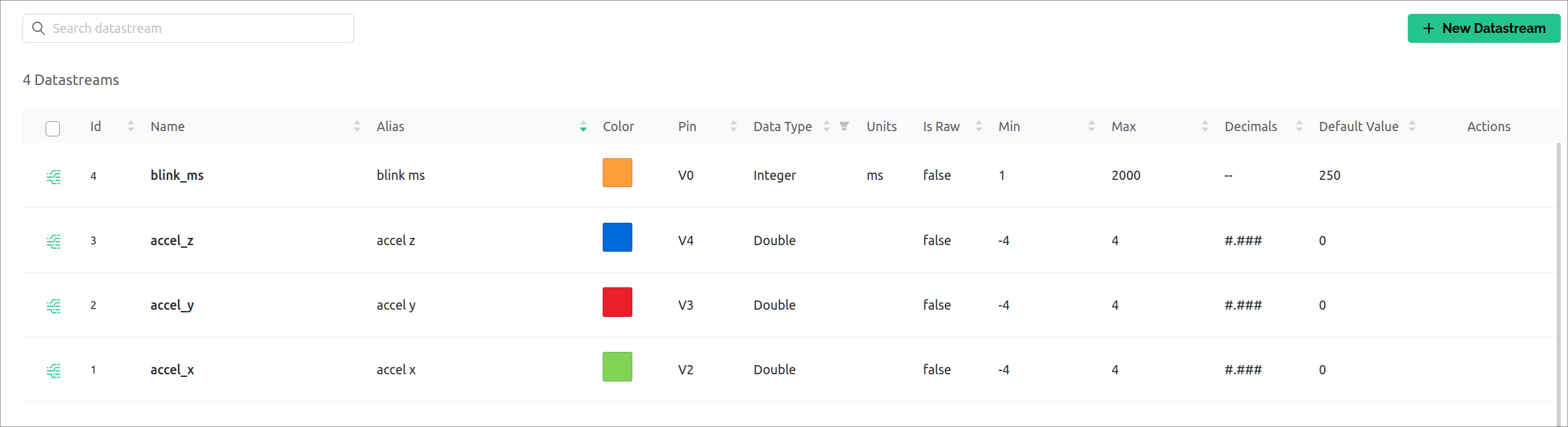
DataStreams
Datastream creation is available in a few basic types, clearly mapped against the GPIO configurations available to the Arduino ecosystem.
| Type | Description |
|---|---|
Analog | Input or output modes, assignable 'unit type' info |
Digital | Input or output modes, configurable pull-resistor setting, no unit info |
Virtual | Integer, Double or String with assignable 'unit type' info |
Enumerable | Map a set of Integer values to strings |
Location | Pair of Double values for latitude and longitude information |
The interface to create templates and DataStreams is well laid out and easy to use.
While it supports annotating data with a unit of measure, the options are less expansive than I expected, mostly covering metric and imperial masses, volumes, durations, distances, speeds, data sizing, and some compound units for pressure or light/signal strength.
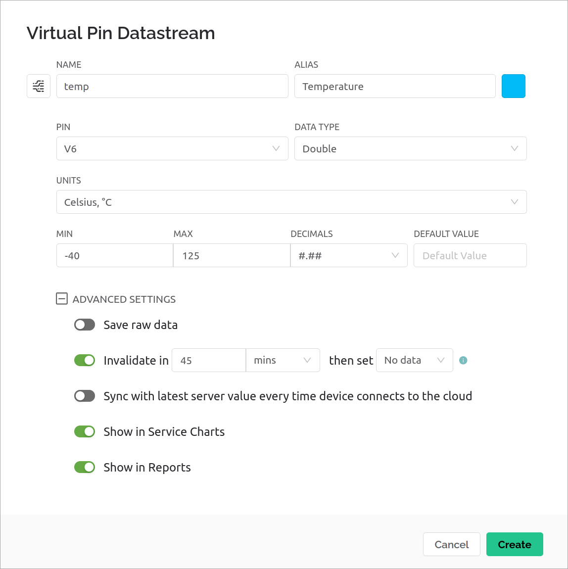
DataStreams also support colour and icons, which are used as defaults across dashboards where practical.
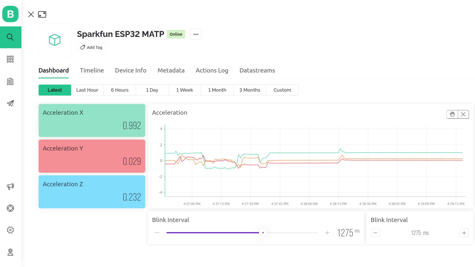
Dashboard Editor
Dashboard creation is reasonably intuitive, built around a drag-and-drop interaction model. The Widget Box sidebar lists available UI components, and once on the grid, the corner handle allows resize while dragging from a Widget's center repositions it.
Along the top of the dashboard is a tab-bar for additional dashboard views, and dashboard-wide time control for all charts on the page.
On the free tier, only one dashboard page is available with a maximum of 10 widgets.
Plus plans are allowed one additional page and 80 widgets, and Pro/Business plans are allowed 3 pages and 255 widgets.
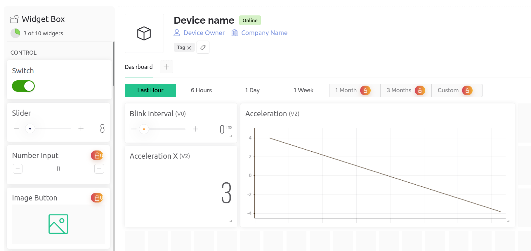
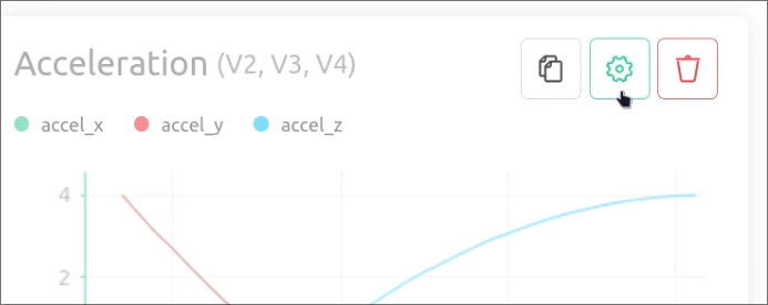
Hovering over a Widget displays some buttons to duplicate, edit or remove it.
Editing a Widget is pretty intuitive, select the Datastream(s) as needed, and make any styling choices where possible.
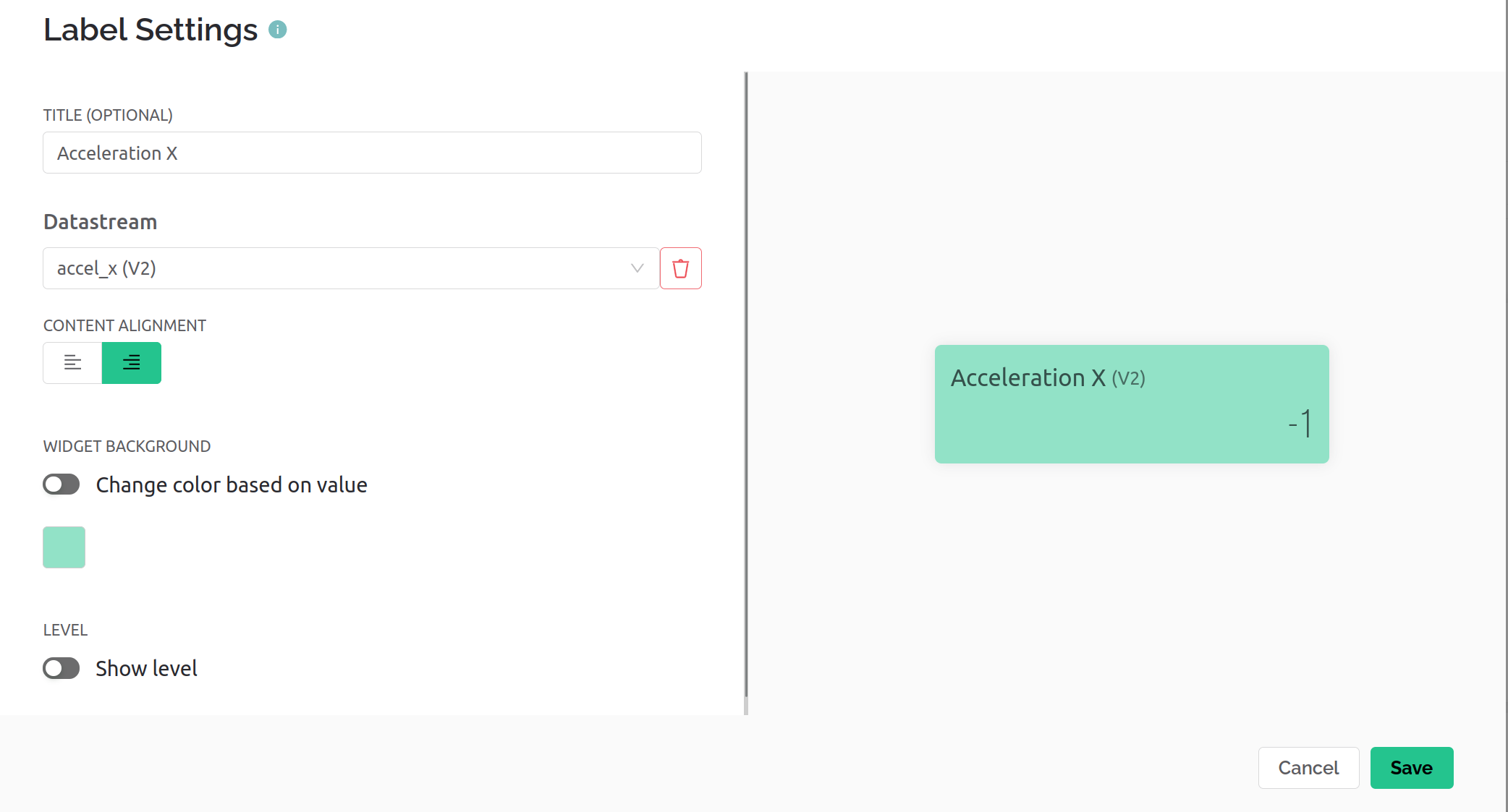
In general this editor functionality does the job, but the minimal set of Widgets and limited charting restrict the potential utility somewhat.
Automations
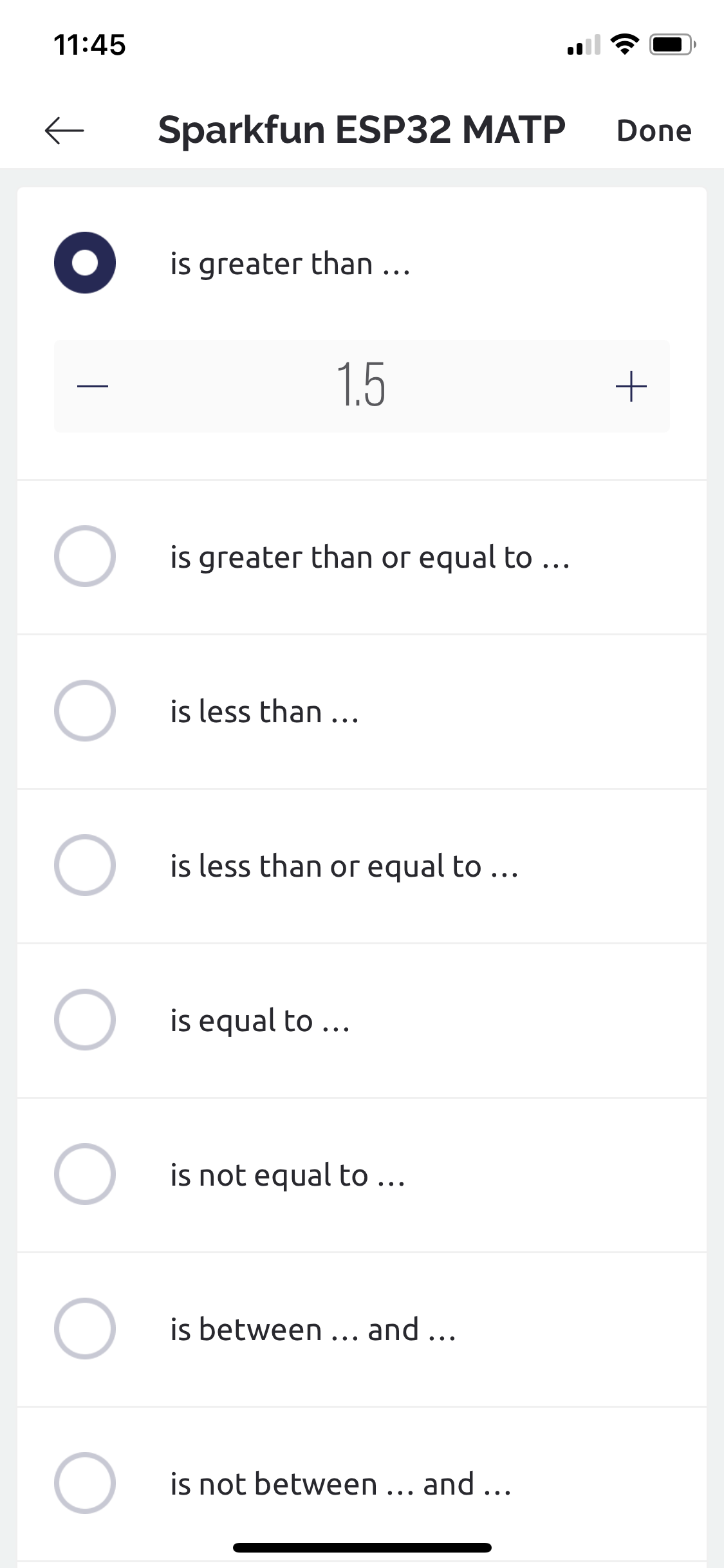
Each DataStream needs to have conditions and/or actions enabled per-channel.
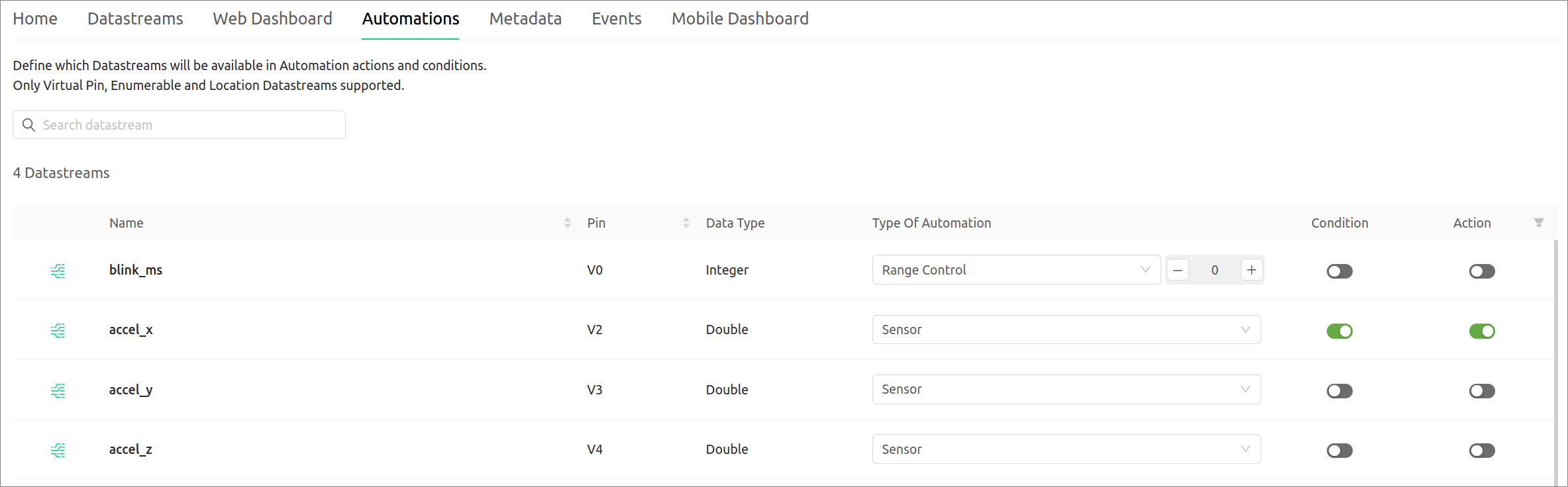
Once added, it's available for use in the Automations web tab, or via the mobile app.
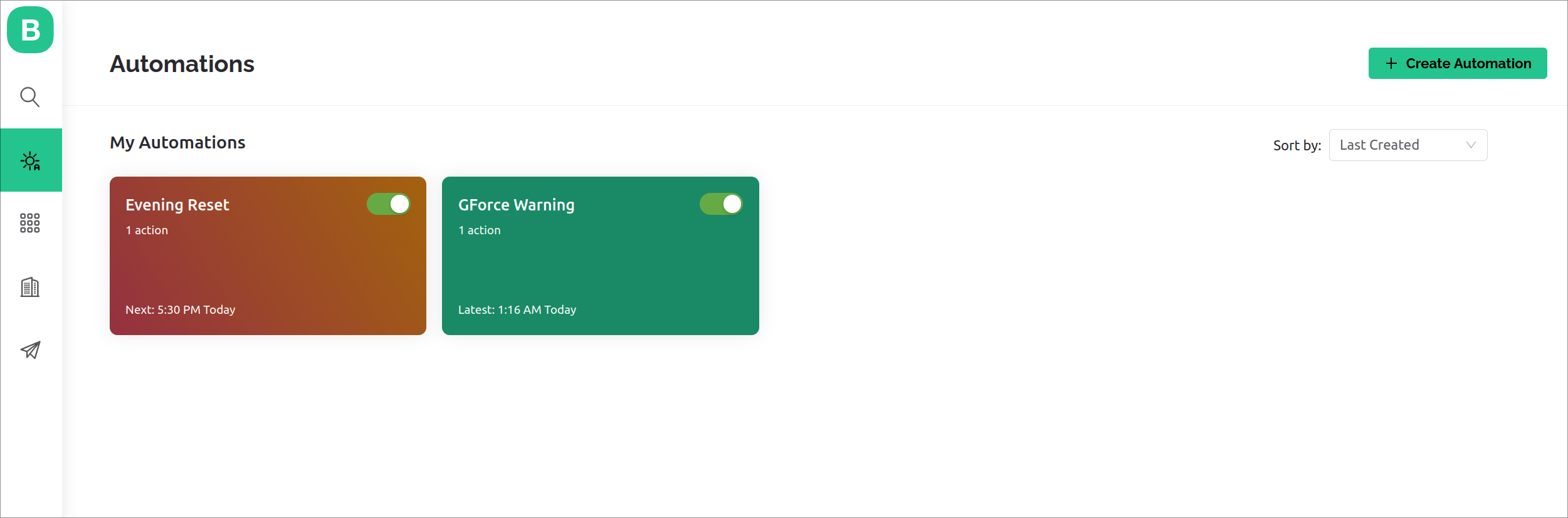
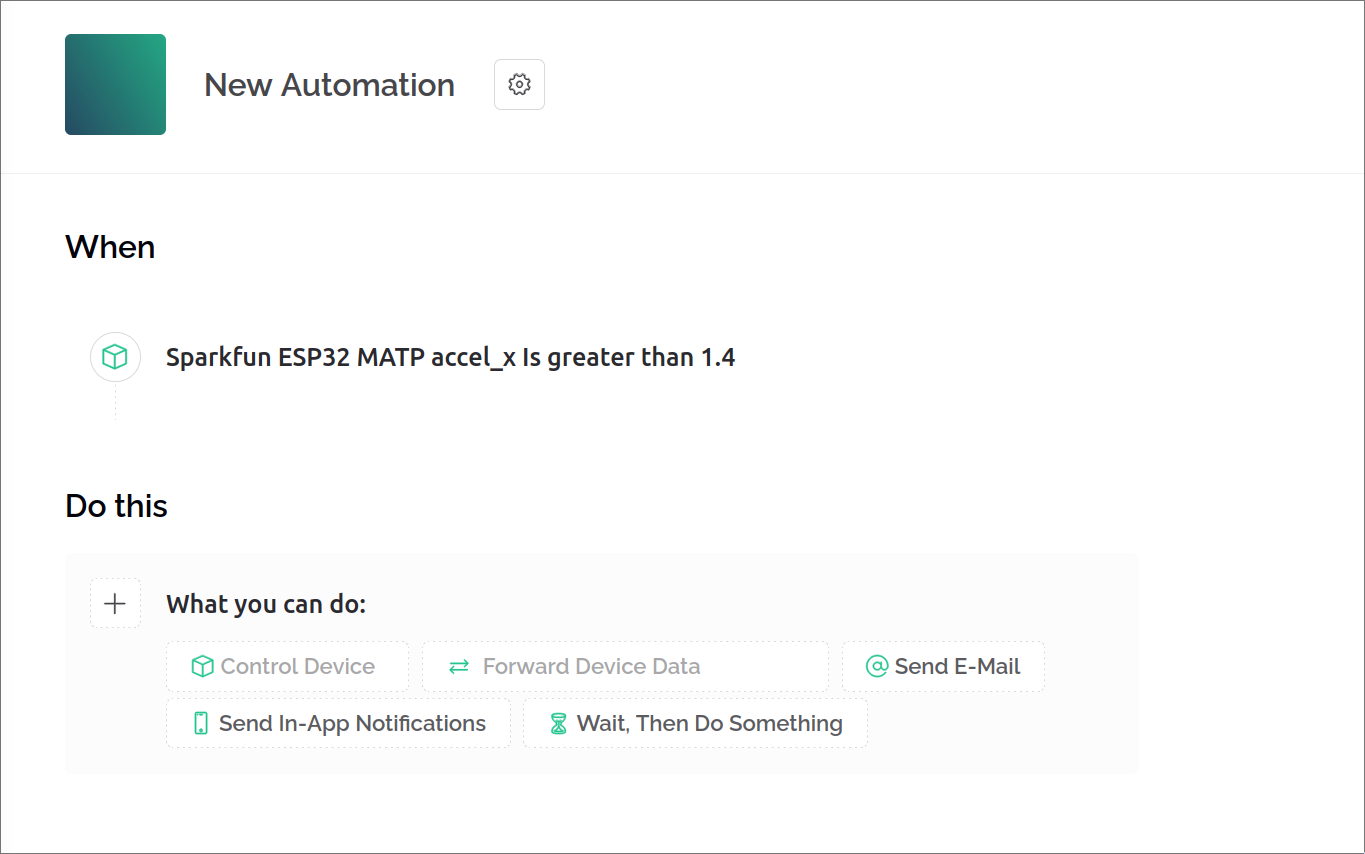
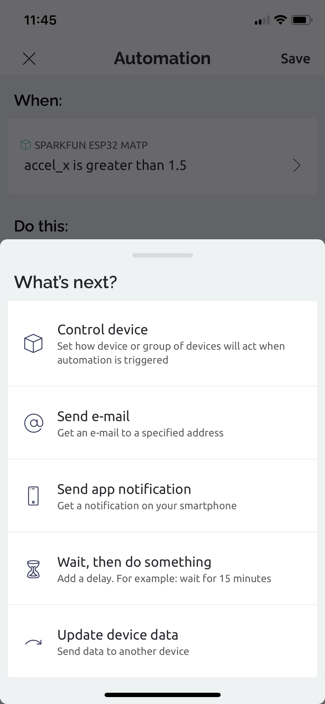
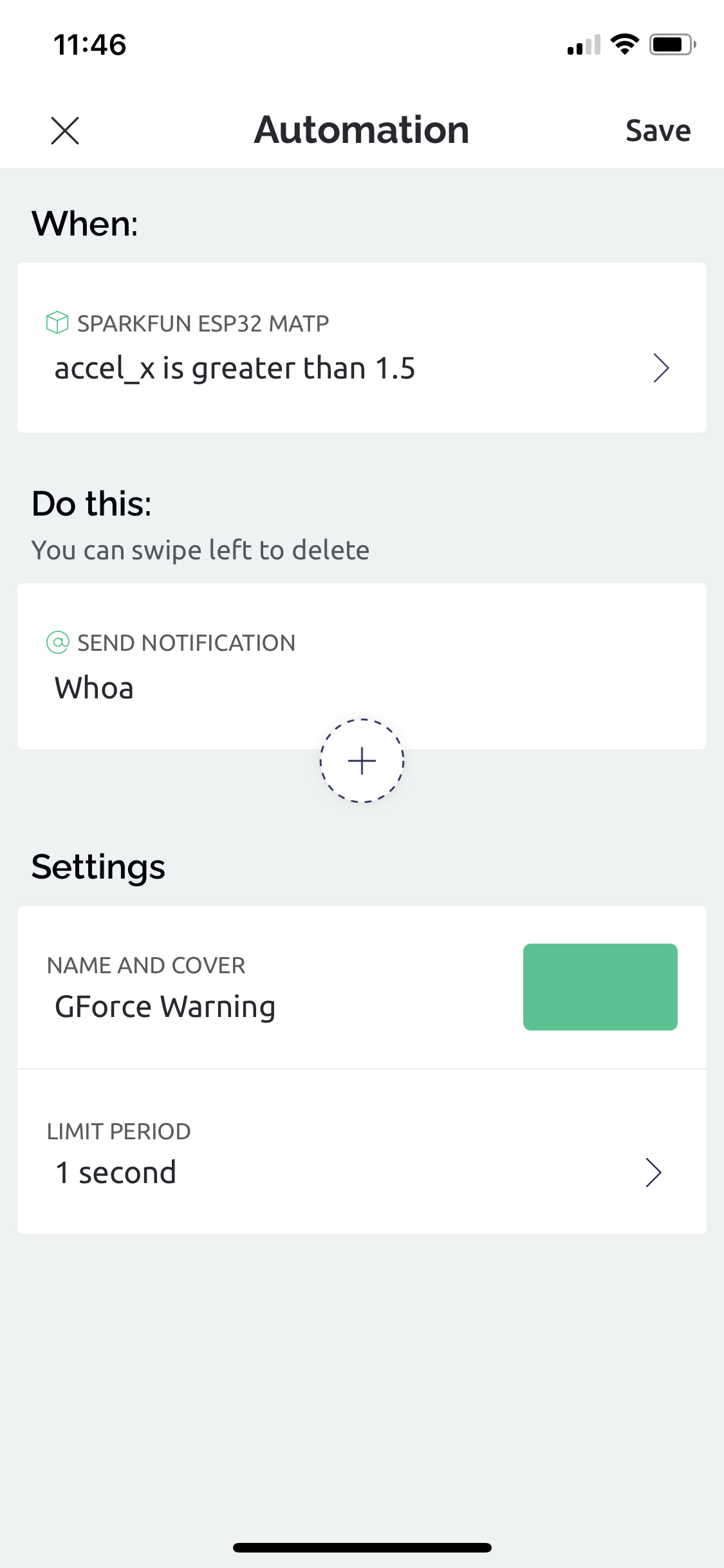
Adding new Automations is intuitive, supporting time based, data based, or manual trigger options.
Once triggered, simple chains of actions can be configured to wait, fire emails or push notifications, and/or modify device states.
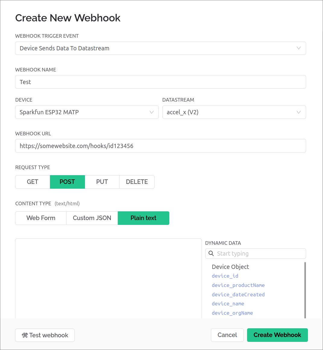
Webhooks
The web interface also supports creating webhooks, and provides a nice builder tool to configure the conditions and what data is provided.
Mobile App
A generic template can be created from the App, but DataStreams can't be created/edited, forcing use of the web interface.
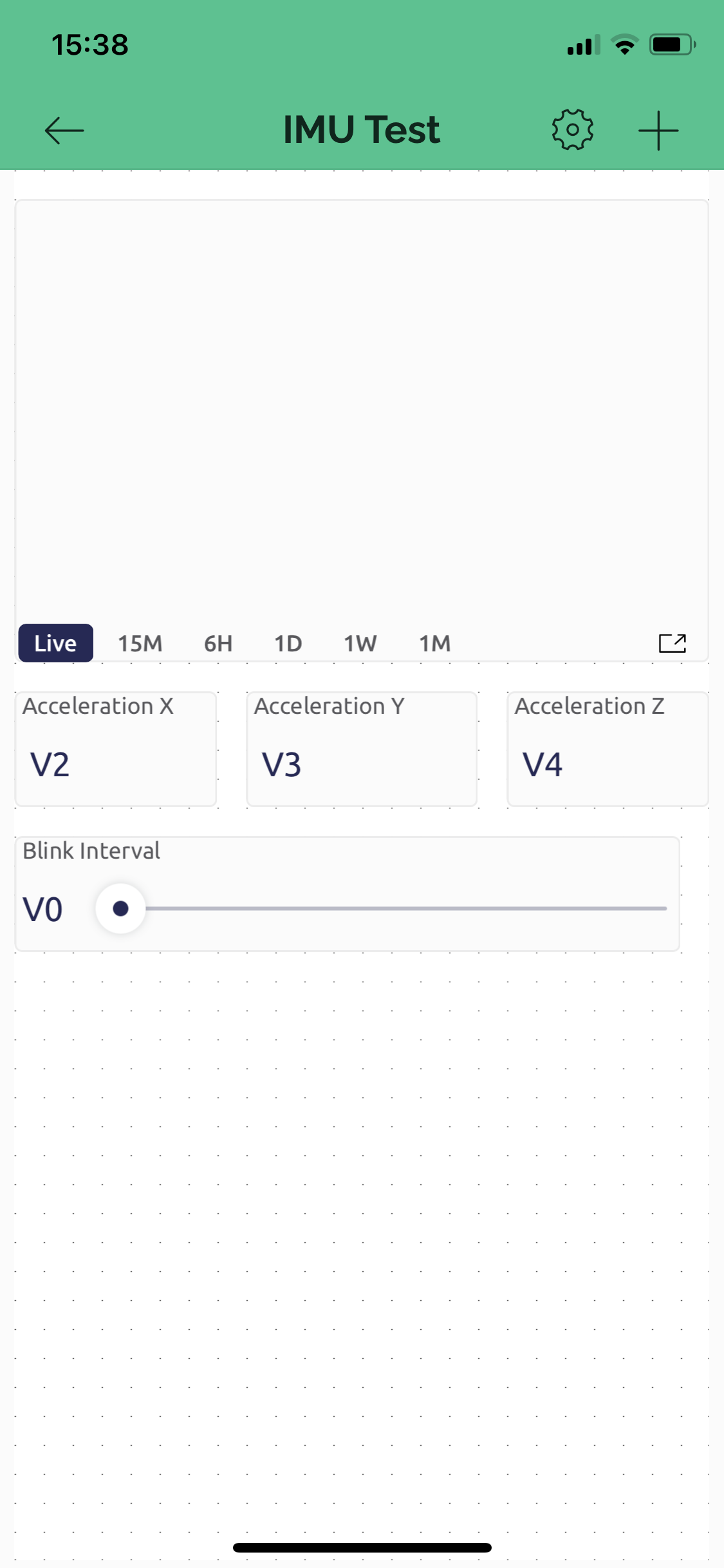
Dashboard
Mobile dashboards can only be designed from the mobile app.
The editor is intuitive, and the integrated first-time explanation provides enough detail to get building without needing to look at docs.
Starting with a empty grid (the dots indicate the minimum position/size snap distances), the plus icon in the top right opens the widget browser.
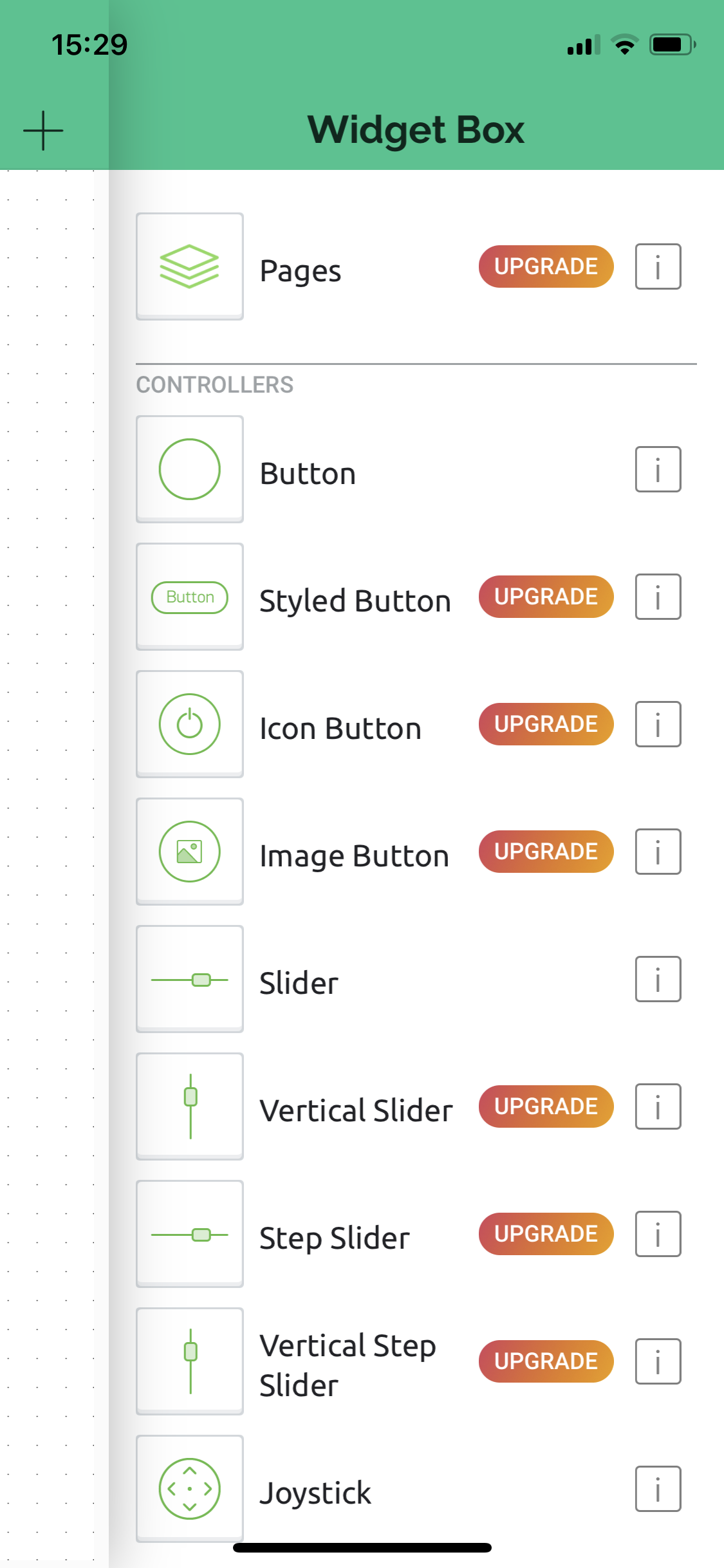
The full list of widgets which cover input, ouput, and act as supporting UI elements include:
Button
Styled Button
Icon Button
Image Button
Slider
Vertical Slider
Step Slider
Vertical Step Slider
Joystick
zeRGBa
RGB Light Control
Step Horizontal
Step Vertical
Slope Control
Switch
Level Slider
Level Slider with Switch
Value Display
Labeled Value
LED
Gauge
Radial Gauge
Enhanced Gauge
LCD
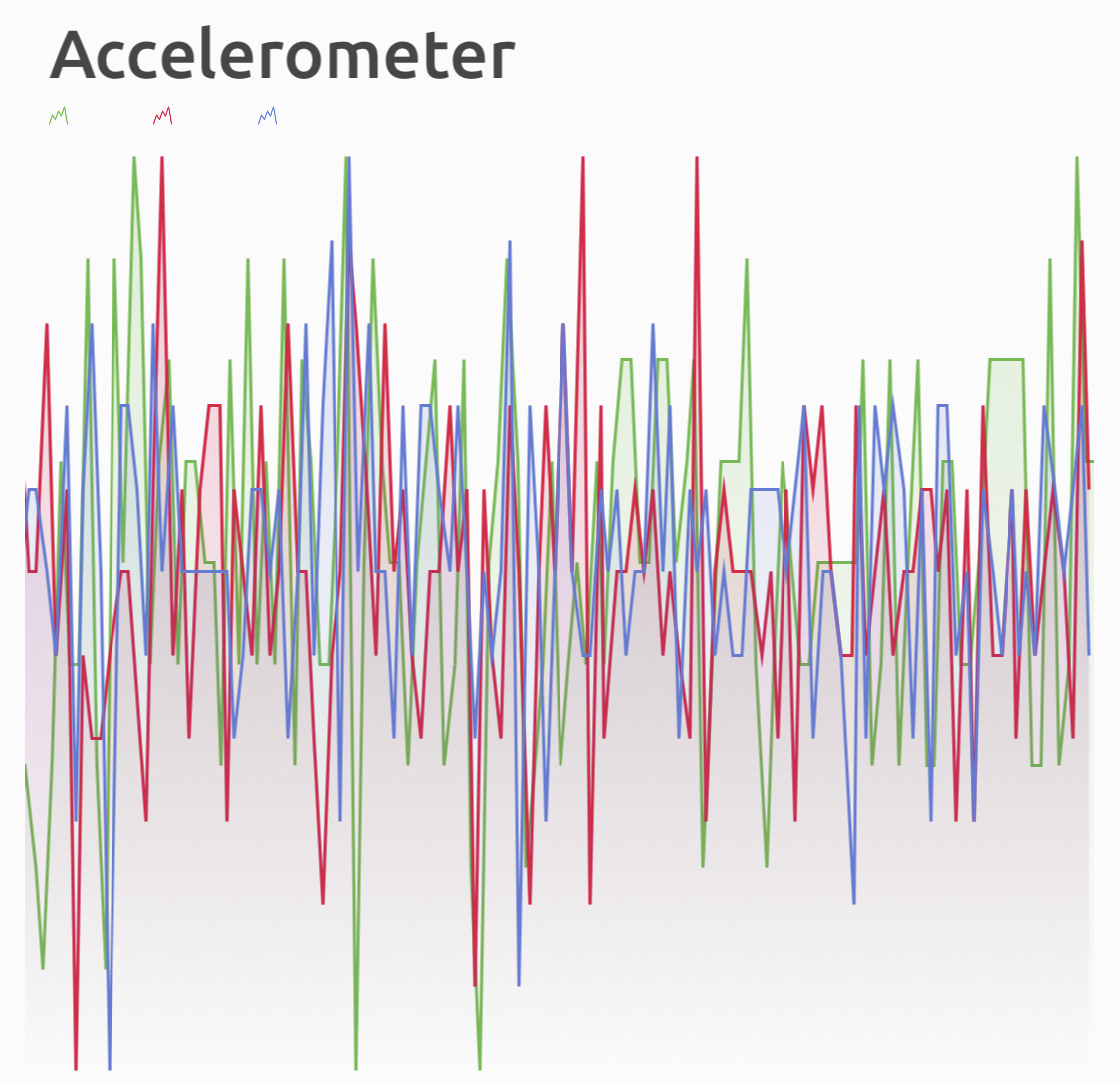
Simple Chart
SuperChart
Terminal
Video Stream
Level Horizontal
Level Vertical
Image Gallery
Gradient Ramp
Icon
Image Animation
Lottie Animation
Page
Tabs
Menu
Map
Text Input
Number Input
Time Input
Segmented Switch
Icon Segmented Switch
Text
Formatted Text
Dynamic Spacer
Music Player
WebPage Button
WebPage Image Button
Alias Name
In the Issues & Bugs section I describe how this unnecessary longform list of widgets could be handled better.
After adding a widget, long-hold on the widget skeleton to activate resize and drag controls, and tap on them to configure them. The editor UX is reasonably intuitive but rather tedious compared to using the web editor.
- Dragging a widget to the top of the display allows for duplication or deletion of a specific widget.
- If you attempt to drag a widget over another, the existing widget won't move until you drag to a sufficient space for it.
- This is an interesting UX tradeoff compared to other drag and drop approaches which typically try to shift the layout to make placing the held widget easier.
- Instead of suffering accidental layout shift, re-organising smaller elements requires dragging any blocking components to a empty 'holding area' on the grid before dragging a widget into that area.
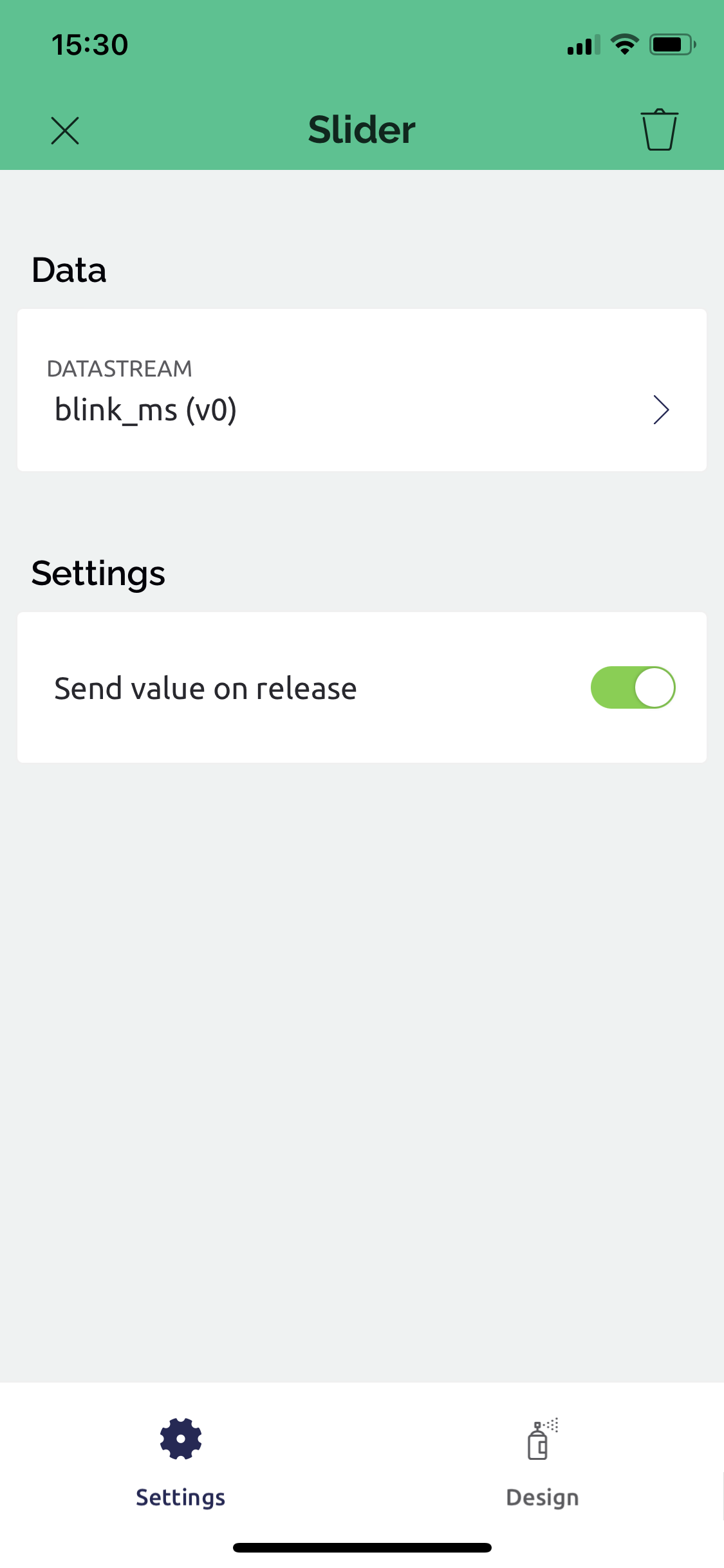
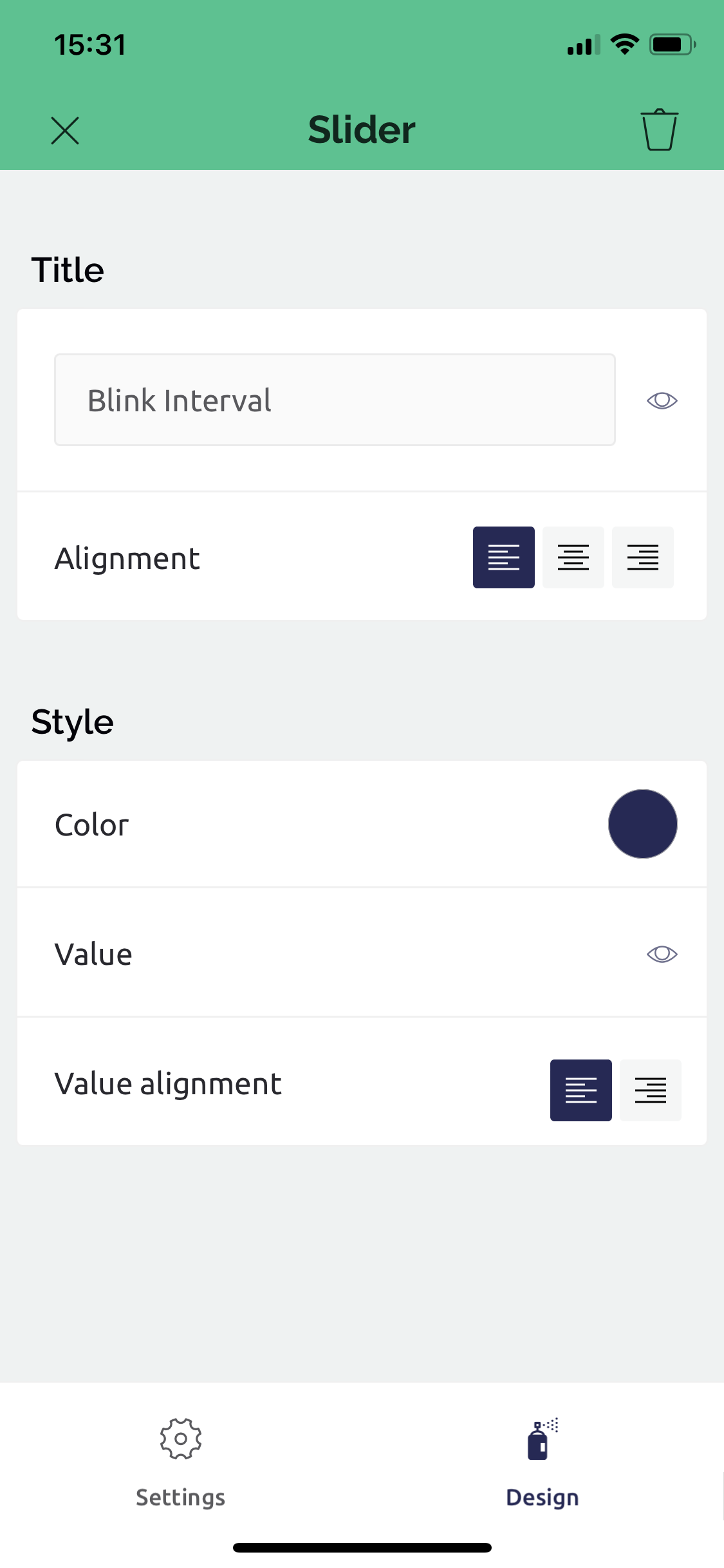
Widget configuration is handled with two pages, behavioural and visual design.
After adding more components and shifting the layout around until you're happy, leave edit mode to view the dashboard with connected hardware (if available).
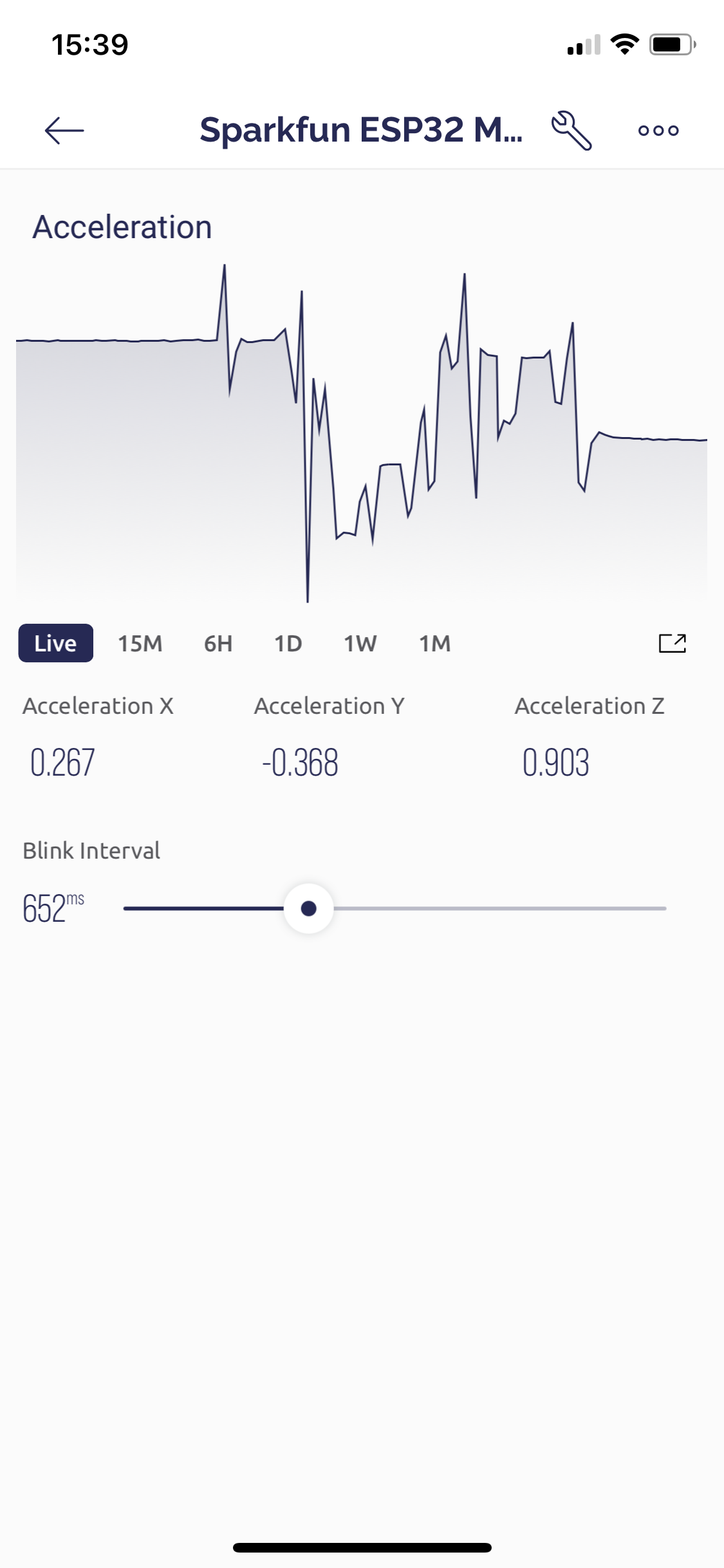
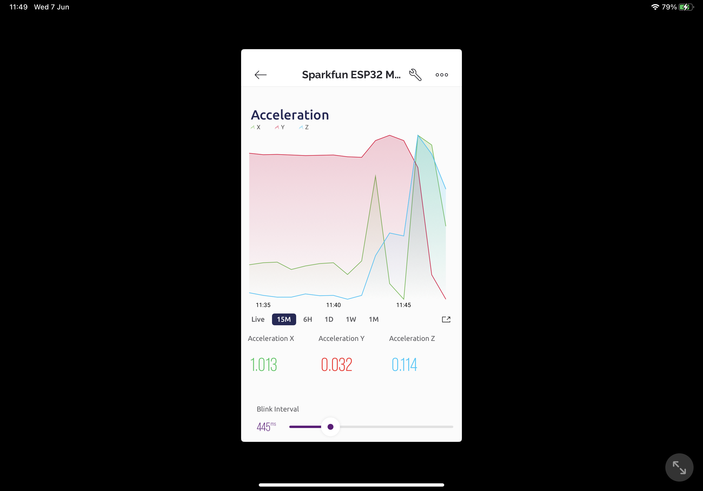
Charts support horizontal scrolling by dragging, and the fullscreen icon shifts to a horizontal chart-only fullscreen layout.
Automations
Creating and editing automations through the mobile app is similar to the web interface, intuitive and pretty configurable.
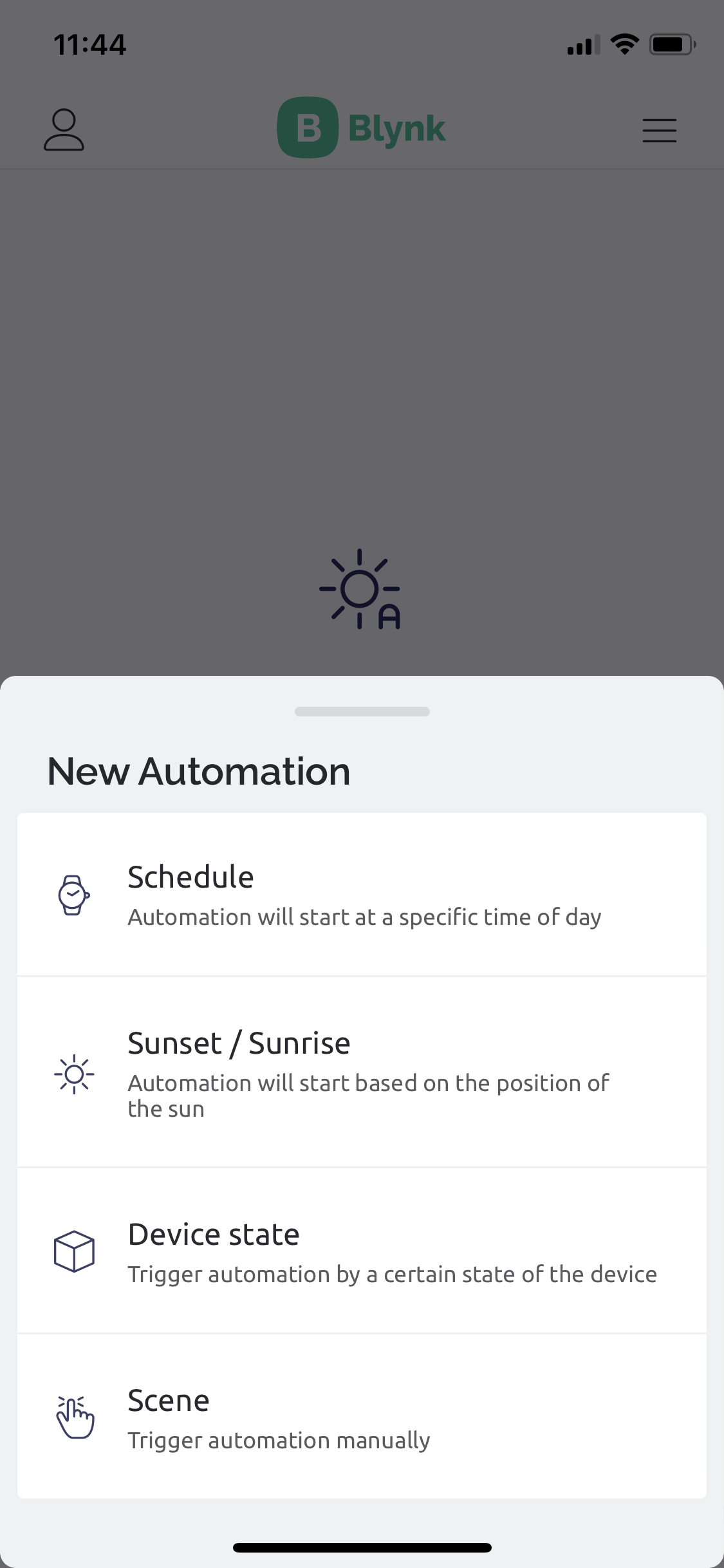
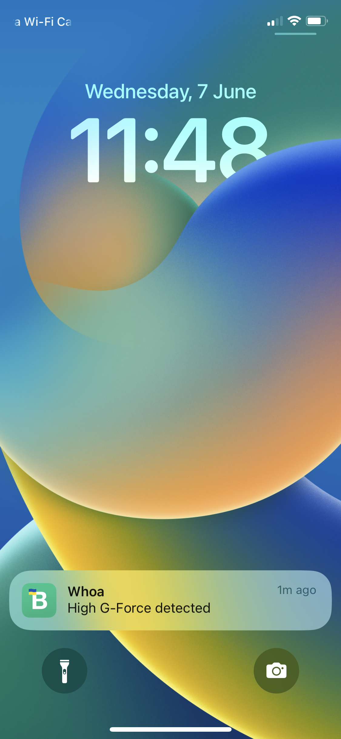
The setup process works well, and the push-notification capability worked perfectly. I was suprised how responsive the push-notification is.
Data Export
From the Console dashboard page, hidden behind the three dots settings button is a "Download Report" option.
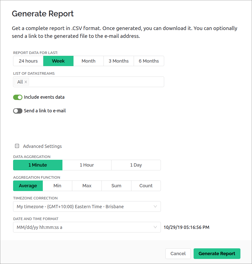
The ability to select datastreams of interest, time period, and how data is aggregated. The report is a zip containing a json file describing the device and who requested the report, the relevant events in a CSV (optional),
| Time | Event Type | Name | Description |
|---|---|---|---|
| 06/07/23 09:57:09 AM | ONLINE | Online |
and a data CSV with a column per datastream.
| Time | blink_ms | accel_x | accel_y | accel_z |
|---|---|---|---|---|
| 06/07/23 10:31:00 AM | 1.00246666666667 | 0.126241666666667 | 0.108325 | |
| 06/07/23 10:30:00 AM | 1.00541666666667 | 0.129016666666667 | 0.1096 | |
| 06/07/23 10:29:00 AM | 915 | 1.004775 | 0.140983333333333 | 0.106808333333333 |
| 06/07/23 10:28:00 AM | 0.999466666666667 | 0.147425 | 0.110158333333333 |
This is sufficiently customisable and formatted in a way that makes the exports useful for off-platform analysis.
Data export functionality is not available from the mobile app as far as I can tell.
Hardware
An Arduino library is available and supports a pretty wide range of networked devices via Ethernet and WiFi. There are a good range of Arduino example sketches.
The library is strongly tied to the 'Datastreams are Pins' concept, and so publishing data is done against the pin or virtual pin:
Blynk.virtualWrite(V2, 2.03f);
and handling inbound data is similar, with a macro based callback function:
// Called when Virtual Pin 0 is changed by the app/web dashboard
BLYNK_WRITE(V0)
{
  blink_interval_ms = param.asInt();
}
It's up to the developer to know what type of data is being received and handle it accordingly.
For other supported platforms like Raspberry Pi, one option is via WiringPi, or alternatively using the Python library.
For a smaller list of supported devices, Blynk.Edgent provides a no-code pathway into the Blynk ecosystem and also bundles a streamlined device provisioning flow and support for OTA firmware updates.
At time of writing, Blynk.Edgent is available for these chipsets/boards:
ESP32
ESP8266
Arduino MKR WiFi 1010 (SAMD21 + ESP32)
Arduino Nano 33 IoT (SAMD21 + ESP32)
Seeed Wio Terminal (ATSAMD51 + RTL8720DN)
TI CC3220
Restrictions
DataStreams are tied to the concept of Pins (physical and virtual), and as such the design has unnecessary limitations which might affect you:
- The Digital and Analog pin options have forced mappings to pin names matching the 'old-school' AVR Arduinos - pins
1-13andA0-A4are supported. - There are 255 Virtual pins available, but they're referenced like pins
V1,V6rather than as a channel for arbitrary data to be transmitted. - Virtual pins only support
Integer,DoubleandStringtypes. - Virtual pins can only carry a single value (
Locationis technically a pair of doubles on one Virtual pin though) - structured data isn't supported. - The library heavily uses macros to handle behaviour of virtual pins, which forces a particular, repetitive code style...
Blynk recommend a limit of 10 requests per second. This is fine for slow systems, but not suitable for realtime telemetry dashboards where responsiveness is required.
Data retention is capped to one point per minute, where Blynk Cloud automatically averages the value. Take care if you expect to find occasional outliers in retained data - for lack of a better idea I'd publish them to another channel when they occur.
The UI layouts are tied to the built-in layout grid format, and on mobile horizontal layouts don't seem to be available.
The charting functionality is generally pretty locked down, charts have limited colour support, don't support different line weights, and legends and axis formatting is restricted to 'visible' or 'hidden'.
Anything that needs an image, i.e. image widget, image buttons, etc - needs the image provided via URL to an externally hosted asset. This is understandable at a technical level, but makes building quick prototypes awkward (this functionality would be great if it supported upload of images for use).
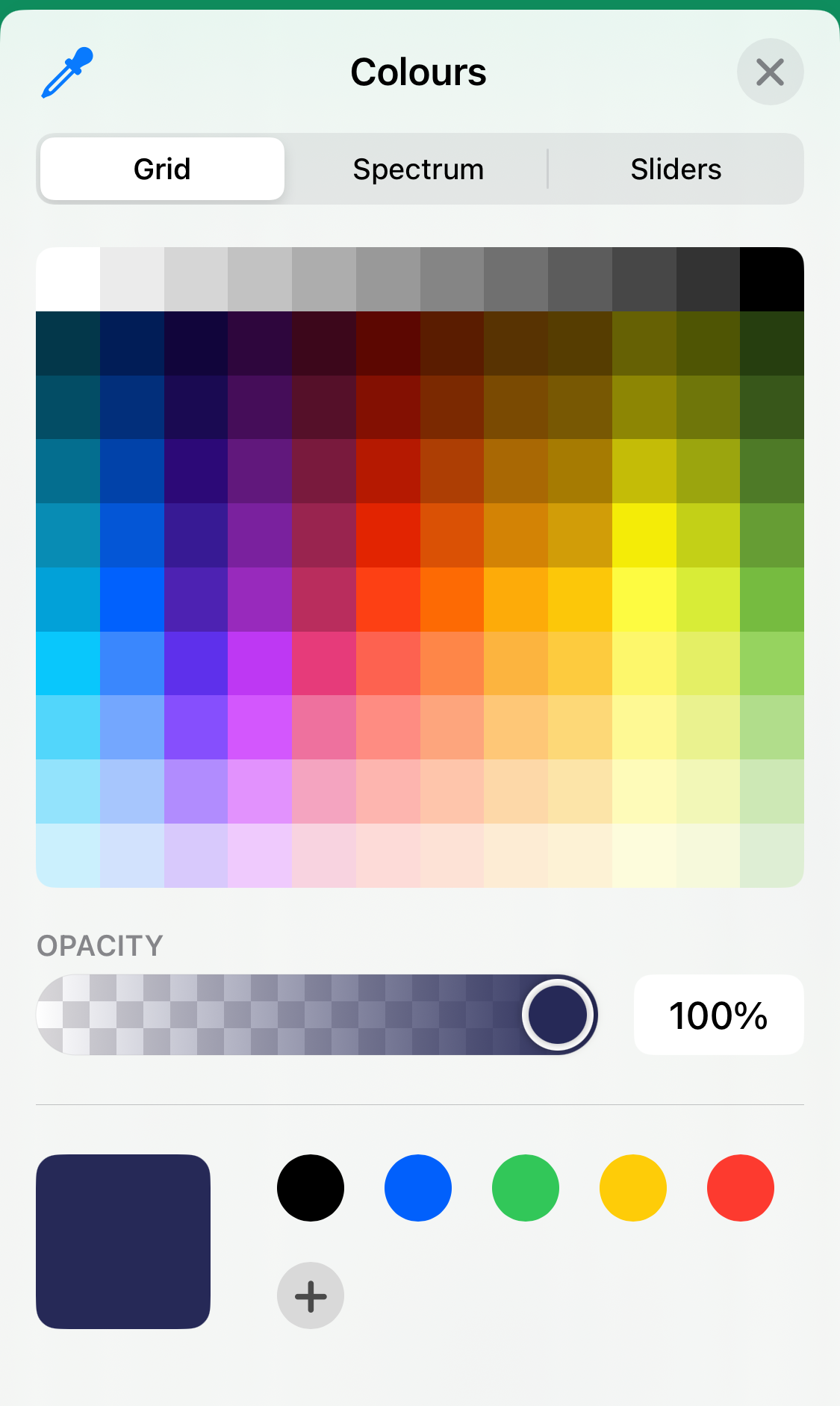
Colour customisation for element highlight colours or chart line colors is restricted on the web dashboard
- Web provides a smaller set of 19 pre-selected colours with 10 levels of shade control
- Mobile offers a wider range of swatches, a full-spectrum picker, and RGB+hex inputs
- Some exceptions offer fewer choices, i.e. SuperChart DataStream color picker only offers 10 colours/gradients.

Issues & Bugs
This section describes incorrect design decisions, bugs and general complaints with the core functionality of the software.
General
Generally the docs are pretty good but there are a few areas where the docs are either stale or incorrect:
- As an example, the mobile app supports both a
Simple ChartandSuperChartbut documents them in different styles, and doesn't describe differences between them (or whySimple Chartis locked behind Pro?).
In situations where user input is applied to a DataStream reasonably quickly - i.e. clicking on + - value buttons - the UI lags behind inputs and the increments inconsistently as it communicates with hardware.
This doesn't feel great as an end-user, and as far as I can tell there aren't any ways to throttle writes to a DataStream from either dashboard UI. The Slider components do have a "send on release" setting though.
Continuing with general DataStream annoyances, unit annotations are missing whole classes of units and and the system isn't user expandable to provide context for common types of data:
- No units for accelerations or rates, other than a few select volume/time options,
- No non-SI quantities such as 'counts' in the context of ADCs or increment based sensors,
- Unable to handle suffix style use-cases like a sensor gain setting ala
1x,4x.
Combined with the lack of customisation for many components, I can see this being a challenge for data-dense dashboards or projects with non-trivial sensing or manipulation tasks.
I'm a little disappointed that most Arduino sketches don't use SSL by default, and only some device examples have SSL variants.
Web Console Experience
I didn't find too many issues with the web dashboard (in the context of setting up and using it as a single user).
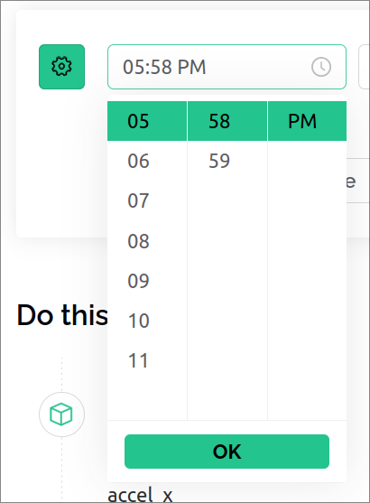
Interacting with the Time picker is annoying - you have to select entries from the scrollable lists and can't enter values via keyboard.
When using the web Console, docs are available via inline drawers - I've complained about other products missing this reasonably simple usability improvement in web builders, but at time of writing lots of rich content integration is broken, and some info items render a 404: Not Found docs drawer...
The same content on the docs webpage has no issues though.
Docs integration through inline help buttons is also inconsistent, in the Console's widget box some components have inline buttons, but many components don't (typically the complex Widgets where this would be most helpful).
Mobile App Experience
Generally, my UI/UX complaints for the mobile app relate to the layout experience, and end-user charting experience.
- The Widget library is unnecessarily cluttered
- Vertical and horizontal orientations are given separate components.
- Some components, i.e.
Step Slidercould have been a configuration setting on the main component.
- I feel like some components are misclassified in the Widget list -
Mapwould therefore fit better with visualisation components like Charts, but is found in 'Interface Elements' along with labels, spacers and menu components . - Would be nice to see components be aware of their layout shape and adapt between horizontal/vertical layouts as needed.
- a rather minor UX suggestion, ideally in-app documentation tool-tips would be presented using native(ish) UI instead of launching an overlay browser for the docs website.
General charting complaints:
- Charts in 'line' mode have a gentle gradient filled under the line (this is distinct from 'area charts' which use a solid fill). Can't be disabled which makes multi-line display a bit visually busy in some situations.
- I find it interesting that mobile charts lack pinch-to-zoom, even though the web charting supports zoom.
- Horizontally scrolling charts by touch has poor render performance.
- Hovering over a line for realtime data doesn't always show all values if the reporting isn't in-line. This is only an issue for 'latest' data as longer timespans apply averaging decimation.
- No ability to configure the printed resolution of values shown in the touch tooltip.
- Legend icons/buttons are tiny and lack configuration.
- The touch targets to show/hide a given chart are also as small.
Also, the iOS app runs in legacy/compatibility layout mode on iPad. Given how polished most of Blynk's UI/UX is, this was a disappointing surprise.
Inconsistencies between Console and App
There's a different level of polish and functionality between the web Console and mobile app experiences. In general, the Console dashboards have fewer, different, widgets available. As a result, you can't achieve feature parity between a web and mobile dashboard unless it's really simple.
One example is the simple button widget:
- Mobile app has widgets for
Button,Styled Button,Icon ButtonandImage Button(which renders web images). - Web dashboard provides
Image ButtonandWeb Page Image Buttonwhich both use web images - there's no basic button with a text label!
Other examples of differences include:
- Different charting functionality and visual style
- Mobile charts allow a custom 'friendly name' for each datastream, web doesn't.
- Mobile uses a shaded gradient for the 'line' chart when web only renders a line.
- Many components are less configurable on the web Console.
- No export/report generation functionality on mobile.
- Colour pickers provide different levels of control as mentioned in the Restrictions section.
Pricing
I'm not going to repeat their official pricing table, the following discussion are my personal opinions based on my experiences with the platform.
The free tier is incredibly locked down, but offers a way to experiment with the platform on small projects. As the platform positions itself as a paid product I think it's unfair to complain about the limitations too much.
Paid subscriptions are broken into two groups, 'personal use' and 'professional use', which differ in their use of Blynk branded UI's on the 'public cloud', and white-label features with a 'private cloud'.
All paid plans have a base price, which increases in steps with device count.
Starting with the personal use subscriptions:
- I think the Plus plan (base 10 devices) is positioned well at $7/month,
- 3-month data retention is similar to Arduino IOT and Adafruit IO at similar price points.
- The widget quota and library offer enough functionality for home/hobby users, but...
- some UI restrictions feel unfair given the ~$40 price gap to Pro, i.e the
Formatted TextandDynamic spacermobile widgets, and page/tab count restrictions on dashboards. - Doubling the cost to $13 for 20 devices feels like poor value, especially given no increase in retention period
- The product positioning is a little confusing for Pro subscriptions,
- Priced outside of home/hobby users, and positioned for hundreds of devices and users
- lacks the features expected for a business setting,
- so it only really makes sense for professionals running an internal use tool, or educational settings
The business plans are more complicated:
- Listing the base 'web only' plan at $599/month is odd, given the relative weakness of the Blynk.Console and no included asset-tracking functionality.
- Realistically, $1000/month is the minimum spend for mobile app support for a single product.
- The value proposition compared to building in-house or via a consultant is reasonably compelling, assuming simple use-cases and acceptance of CAPEX vs OPEX compromises.
- A monthly fee for localisation support is rough.
- Given the prevalence of mobile and web analytics platforms and tools, and lack of information about it, I feel that this functionality should be built into the 'turnkey platform', or provided via integration with a 3rd party tool at no cost.
Recommendations
Overall, the Blynk platform offers a good range of functionality which covers the key requirements for building a mobile app around cloud-connected hardware. The web-dashboard is usable, but feels more like simple tooling for administrators rather than a viable web-dashboard offering.
The developer facing editor UI and end-user dashboard UI's have a consistent style and modern feel, and are generally intuitive to use. Documentation and examples have a high average quality which is great to see.
If you're looking at using Blynk for your project, check if the relatively low maximum update rate, low-resolution decimated data storage, and internet requirements might constrain the functionality of your project.
Beginner/Educational Users
Blynk's documentation and wide community adoption make it one of the stronger recommendations in the 'IOT app builder' category, assuming that your project is Arduino based and can fit inside the limits of the free tier.
Starting with Blynk as a first IOT experience is sensible, as it provides enough functionality that you can grow into more advanced projects, assuming you're able to afford the Plus subscription.
Serious Users
The free tier is incredibly restrictive to users trying to build anything beyond a simple 'report a sensor' project. As such, I'll make the assumption that anyone using Blynk beyond small toy dashboards will upgrade to a Plus subscription for the (mostly) unrestricted range and number of Widgets.
At the Plus or Pro subscription tiers, Blynk outclasses other IOT platform + app options, but I feel the firmware integration warrants caution - jumping into larger or complex projects needs pre-planning of virtual pin usage to avoid introducing accidental bugs and broken callback functions, and I'd stay away from hardware pin usage entirely.
Blynk's strengths are tied to it's lack of infrastructure/setup requirement, and a quick 'time to app'. If you don't need both cloud functionality and a low-code dashboard builder, or can tolerate setting up infrastructure and doing some programming, then I'd suggest looking at other options or consider setting up a MQTT broker+dashboard solution.
Professional users
Disclaimer: I haven't used the Blynk.Studio custom builder service/concierge. This is written in the context of shared tooling with Blynk's cloud, web, and mobile platforms, reading their OSS embedded code, and general consideration of their products positioning.
The value proposition is interesting at the professional/production application level.
The business and enterprise white-label plans might make sense for a specific market, but building your product with any 'platform as a service' provider has a few large caveats in the form of UI/UX restrictions, low-code business logic limitations, monthly subscription costs, and typical concerns around product ownership and trusting a third party with such an integral part of your product.
I think Blynk makes sense if your company doesn't have any mobile or 'full-stack' developers and can't easily contract out, or you are already building with low-code tooling. It probably also makes sense for prototyping a MVP, or enhancing a low-volume product that would otherwise be viable without any 'connected features'.
I think Blynk is a poor choice if your business wants or needs to ship larger volumes of units, handle moderate or high rate signals (>2Hz), provide low latency experiences, or drive more complex visualisations or interaction patterns than Blynk's widgets provide.
I don't think Blynk would be a good suggestion for companies building products where the software is a large part of the product's capability and end-user experience. Blynk's primary product is their own dashboard and mobile apps, which have design limitations and UI/UX issues. If the product's software isn't already similar to the existing tools, I suspect you'll hit the ceiling of functionality and user experience pretty quicky.